
5 Best and 5 Worst: 2025/26 Premier League Kits
- Ashland Connelly
- Oct 2, 2025
- 5 min read

Welcome back to "5 Best and 5 Worst", where we analyze different characteristics of sports leagues. This week, we'll be looking at the Top 5 Premier League outfits for the season. As one of the sports leagues where jerseys undergo different alterations every year, the Premier League consistently offers great designs, and this year was no exception (save for a few exceptions). With that said, here are the best and worst jerseys in the Premier League.
#5 (WORST): BRENTFORD FC AWAY KIT

With an abundance of teams going the gold route this year, Brentford is easily the one that leaves me the most disappointed. Most Brentford kits are hit-or-miss, and this one is no exception. I can appreciate the stylized jersey and the use of a brown base to supplement the design, but overall, this is just the epitome of "not for me", though I'm sure plenty of fans really enjoy this design.
#5 (BEST): NEWCASTLE UNITED HOME KIT

Of the "never changing" designs in the Premier League, Newcastle's is usually one of my favorites, and this year, they clear the rest of their stagnant brethren. The white and black stripes are an icon of soccer, and the blue accents present in this year's design call back to the bottom of their crest in a brilliant way. While I wish the sleeve sponsor wasn't as intrusive on the design, I can overlook it for one of the top quality jerseys in the league.
#4 (WORST): FULHAM FC AWAY KIT

Neon green is a color typically reserved for goalie uniforms with good reason. This Fulham kit has a decent idea, and I do personally love the restyled crest, but I just can't get behind this coloring for an on-field player. At the end of the day, this is just another jersey that I just can't see fans enjoying. Someone being a Fulham fan is torture enough; making them wear something like this just adds another level to it.
#4 (BEST): LEEDS UNITED AWAY KIT

I'd argue this is the most underrated jersey in the PL this year. I always love it when sponsors cater to the jersey's design, and Red Bull and Leeds have come together to create something spectacular this year. While it is just "the Swedish National Team", the striking blue and yellow with the newly colored sponsor's logo create a great-looking jersey that'll surely be remembered as a popular one for Leeds fans for years to come.
#3 (WORST): BRIGHTON AND HOVE ALBION AWAY KIT

Brighton (and Hove Albion) isn't known for their quality of kits, but goodness, this is underwhelming. The simplistic design can work; however, the shades of lavender don't quite contrast enough for the design to pop, and the sponsor logo being in another shade of this purple while the centered crest is in black is equally confusing. Just overall a very underwhelming jersey that home fans are happy they won't have to see unless they wish to travel for a game.
#3 (BEST): ARESNAL FC AWAY KIT

Arsenal has a habit of taking big swings with their away jerseys. Last year's jersey was so good it nearly made me an Arsenal fan, and this year's, while not as grand in my opinion, is still a great look for the team. The color effect on the blue paired with the black collar and silver coloring for the sponsors and crest creates a great jersey that fans will surely love on the streets. Arsenal have created an all-time jersey which will look great as they finally won't finish 2nd in the table this year (instead finishing outside the Top 5)
#2 (WORST): ALL OF CRYSTAL PALACE

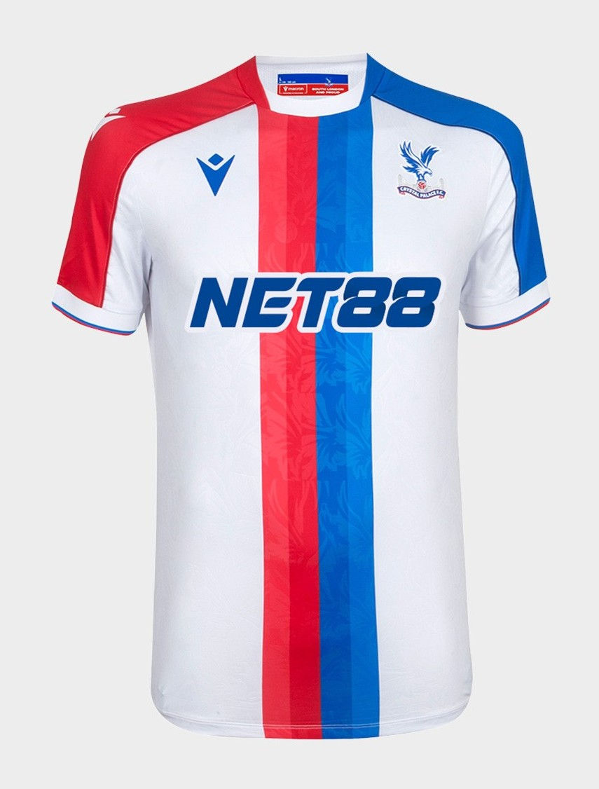

Why does this have to be the year the Eagles break through? At least their 2024/25 Kits got to see the team to an FA Cup Championship, their first trophy in team history, but this is seriously the follow-up to one of the most majestic jersey catalogs in league history? The iconic red and blue striping has taken on a matte palette that underwhelms. Then, there is the weirdly striped away kit that leaves much to be desired, and all of that is before we get to the "mustard" gold third kit, meant to replace the iconic yellow eagle from last year. Overall, just a horrific collection, but this is the sacrifice I make for Palace being 2nd in the table.
#2 (BEST): MANCHESTER UNITED THIRD KIT
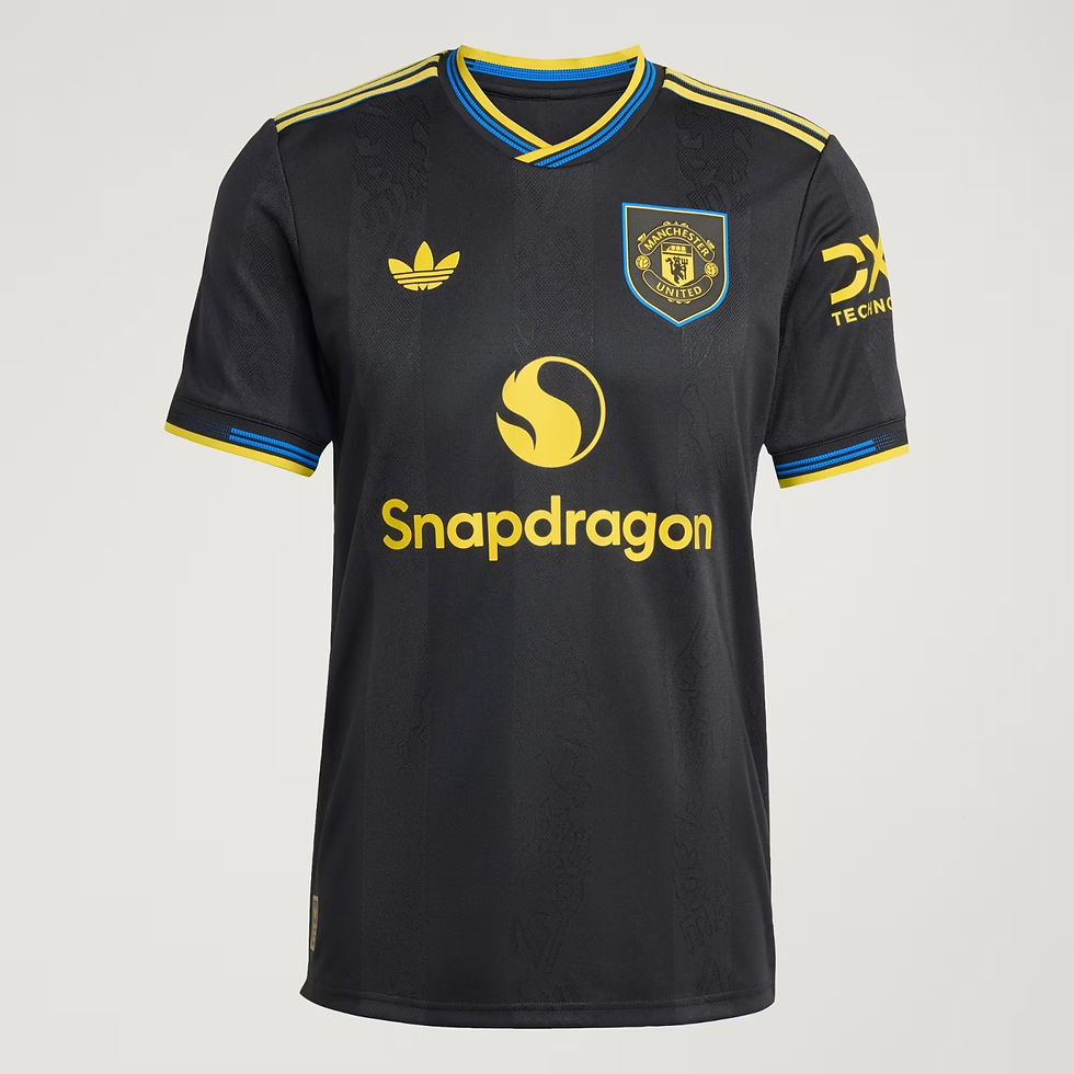
In a year full of great throwback jerseys, Manchester United's throwback to one of their greatest away kits is an excellent addition to the catalog. While this rating is certainly propelled by being a massive fan of the Reds, the grand return of this beloved jersey has been well-regarded by fans, with the gold and blue accents playing brilliantly together over the stylized black base, having the United devil in the off-colored stripes along the jersey. While the team on the pitch has nothing on the team that wore the original, the grand return of this black United jersey makes it one of the best of the year.
HONORABLE MENTIONS (WORST):


#1 (WORST): MANCHESTER CITY THIRD KIT

I mean...it speaks for itself. It's bad enough that it belongs to City, but this concrete gray supplemented with a neon green is not pretty on the eyes. Add in the weird bluish gradient on the crest and Puma logo, and you get a string of baffling design choices that somehow cleared the focus groups. If I weren't already a United fan, I would certainly be rooting against City for fielding the worst jersey in the Premier League.
HONORABLE MENTIONS (BEST):


#1 (BEST): NOTTINGHAM FOREST HOME KIT

A bit of a surprising pick if I'm honest, but I love the Nottingham Forest home jersey. The classic collared look paired with the shield around the home crest gives it a timeless vibe, and the addition of the off-colored striping every other stripe makes this jersey one of the greatest in Forest's collection, and definitely the best jersey of the year. Hopefully, this brilliant kit sees them to much success in their Europa League campaign as the only thing that could make this jersey better would be having a trophy tied to it.


Comments