
Despite Leaks, The 2026 MLS Archive Collection Remains a Mystery
- Ashland Connelly
- 3 hours ago
- 6 min read


In our era of easily traveling information, it's a miracle that the MLS Archive Jerseys for this year have yet to be accidentally revealed to the public despite their upcoming summer release date. While not much is known about the actual designs or even the colors of the jerseys, we do know the teams that will be supporting this awesome collection of throwback jerseys in the MLS.
Author's Note: While writing this blog, two of these teams actually had their jerseys leaked early, so their supposed uniforms will be talked about in place of any speculations.
AUSTIN FC

The newest team on the roster of 8, Austin FC, has quickly turned the Texas capital into a soccer city. After being debuted in 2018, Austin FC took the field for the first time in 2021, and therefore has little history of its own to pull from. While they could elect to pull from defunct teams like the Dallas Tornado or the Austin Aztecs, they likely will go for a "fo-back" design, much like many of the newer teams in the Archive Collection, like Nashville, Miami, and Charlotte. Austin FC has a great brand and will absolutely spawn a creative original design for the season.


CHICAGO FIRE

The home team of the author, the Chicago Fire joined the MLS in 1998, and won the MLS Cup in their inaugural season, sparking a run of dominance as one of the top teams in the MLS through its first two decades. While the 2010s saw a sharp falloff of performance, the team recently broke their streak of no playoff victories since 2010 last season, and has an exciting roster this year that pits them in the top half of the Eastern Conference. With a lot of history to pull from and the Archive Collection's focus on the 70s-90s era, the team will likely go towards their championship look from the 1998 season that won the MLS Cup and U.S. Open Cup, which would be immensely popular amongst fans, especially with the return to that iconic crest. Many think a potential throwback to the defunct NASL team "Chicago Sting" is in the cards, and the team's yellow and black palette would be a start contrast for the team, matching their Columbus rivals in color. Additionally, I'll throw a bone towards the incredibly popular third kit from the 2013-2015 seasons, which was a black uniform complete with the city flag striping on the sleeves. With all of that said, this throwback should be set in stone. The Chicago Sting would be fun, but fans long for the return of that old logo that saw the team through its best years with legends like Klopas, Nowak, and Stoichkov.


HOUSTON DYNAMO

From one historic team to another, the Houston Dynamo are one of the most storied teams in the league, especially for their historic back-to-back MLS Cup Championships in 2006 and 2007. It's without question that the Dynamo will throw back to their inaugural championship look from the 2006 season, complete with their old logo and wordmark across the front of the jersey. The look will be immensely popular among fans, and there are no other options, in my eyes, that come close to topping how much of a slam dunk this design would be for the Texas team.


CF MONTREAL

The first of two Canadian teams on the roster, CF Montreal has a lot of pre-MLS history to pull from with their old identity as the Montreal Impact. They were founded in 1992 in the APSL and wouldn't join the MLS for 2 decades, as they would league hop several times, retaining the same identity. Their 90s Away kit from this era is a stunner on the eyes, reminding me a lot of Fiorentina's iconic (yet controversial because of a misprint painting a Swastika on the player's shoulders) 92-93 Away kit. The jersey also saw the team to a 1994 championship. Additionally, their Home kit in the American A-League from 2004 is a great one, with the enlarged logo being a unique touch that separates this jersey from all others, looking more like a hockey sweater than a soccer jersey, and also winning a championship that same year. Lastly, there's always the option of the defunct Montreal Supra, which played in the years before the founding of CF Montreal in the CSL. With many options to choose from, I personally hope Montreal pulls from their inaugural away jersey; there are several they can choose from that would all be beloved by the Canadian faithful.


ORLANDO CITY

Arguably the most interesting case of the bunch, Orlando City was originally founded as a USL team in 2010, and reached MLS status in 2015. While it is fairly obvious that the team could return to their roots in the USL, it is worth mentioning that this does put them outside of the original intention for the MLS Archive collection, going back to 2011 at the furthest, instead of the 1990s or even the 2000s. They could additionally throw back to the Orlando Lions of the USL, which sparked soccer in the Florida city for nearly a decade. However, one route they could go is one I sincerely hope they attempt, and that would be a throwback to the Tampa Bay Mutiny. The team was a member of the inaugural MLS Season in 1996; they folded following their 2001 campaign. The brand is one synonymous with the founding of the MLS, and would be an excellent brand revival in much the same way Sporting Kansas City brought back the Kansas City Wizards, or the San Jose Earthquakes brought back the San Jose Clash. While there are many routes for Orlando City to go down, I personally pray they elect to bring back the Mutiny.


PHILADELPHIA UNION

The Philadelphia Union began play in 2010, and, unfortunately for my speculations, have already had their design leak. The Union will be playing in a "fo-back", a false throwback inspired more by the era than any team designs. The design will have a beige base, supplemented by an almost "Polaroid" design palette, and a brand new minimalist wordmark and secondary logo that complete a stunning kit. While I am a tad disappointed the team didn't try to pay homage to former teams like the Philadelphia Atoms and Philadelphia Fury of the NASL (the former of which being the 1973 NASL Champion), this design is nonetheless a near-flawless kit that will look great on the field this summer.


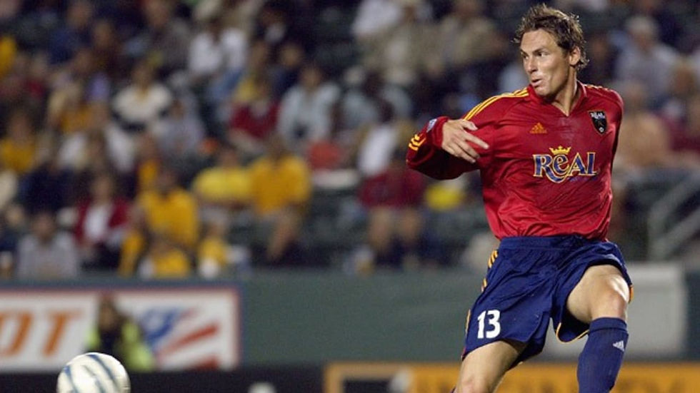
REAL SALT LAKE

In 2005, Real Salt Lake joined the MLS after being awarded a franchise the previous year, and, much like the team above them, their design has leaked, and it is set to be a stunning throwback to their inaugural years. The "Real Salt Lake" wordmark is set to make its grand return on a black base with a maroon-shaded mountain pattern behind it. The striping and logo are set to be gold and black, and this jersey will be a fan favorite for fans of Salt Lake. While I was a little surprised that they didn't elect a throwback to their championship season in 2009 or a maroon base for their kit, this design and the return to a popular wordmark logo will surely be beloved by fans.

VANCOUVER WHITECAPS

We close our list with another historic Canadian team. A team with a history that dates far into the 1970s, the Vancouver Whitecaps have several great jersey options to go back to for this Archive Collection. I am a big fan of their 1983 jerseys, specifically because of the red maple leaf on the sleeves just below the number. Their days as the "Vancouver 86ers" also yielded some strong jersey designs, with the 1997 and 1987 being great standouts. If it were up to me, 1983 would be the year, but you can't go wrong with classic Whitecaps jerseys.


Comments